Pili unveils its new graphic identity
September 24, 2024 - After a decade of existence, Pili's rise to maturity and its entry into the industrial landscape call for an redesign of its visual identity. Originally, Pili was born with the idea of producing eco-friendly inks, hence the drop-shaped logo. That was in 2015. Today, Pili's mission extends far beyond inks to many areas of color, textiles, polymers, inks, paints and coatings. In addition to its research activities in biology and chemistry, Pili produces its sustainable pigments and dyes on an industrial scale.
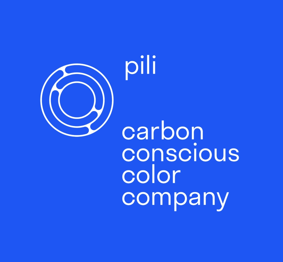
The logo
Biology immediately strikes with this cell, revealing internal compartments, and the oblong shapes swimming inside are reminiscent of micro-organisms. But chemists will not fail to notice the atomic orbitals and the nod to the tetravalence of carbon, a tribute not only to the four bonds of carbon, but also to the four letters of Pili and the four terms in the “carbon conscious color company” baseline.
The organic, rounded appearance, a reference to the living world, is counterbalanced by a perfect geometry, like that of ball bearings or mechanisms, echoing demanding, reproducible and controlled industrial processes.
The name Pili is placed as an exponent of the logo, giving it immense power, as in mathematics. But this position, slightly set back, also evokes a stance of humility. Pili becomes a satellite for the spherical symbol, which then appears as the planet Earth. We’re not far from the overview effect described by astronauts, who become aware of the beauty and fragility of the Earth as they contemplate it from space. And it’s precisely by taking a step back from the ecological crisis that Pili observes, thinks about and develops production processes that are both sustainable and respectful of life on earth.
carbon conscious color company
Our baseline is based on four terms, like the carbon atom that forms four bonds with its acolytes. Four Cs, like a carbon chain, support of all life and the foundation of organic molecules. Carbon is essential to life on Earth, but its excessive concentration within the atmosphere as a result of current human activities is disrupting the balance.
Being “carbon conscious” is a new way of living in the world, of being responsible and aware of carbon cycles and the need to limit our emissions.
Pili
For a long time, it was thought that evolution could only take place vertically, from generation to generation, but this was without considering the ingenuity of micro-organisms, which use pilis to evolve during their own lifetime.
These small, hollow, tubular appendices enable microscopic collectives to connect and benefit from the latest evolutionary developments.
To meet the challenges raised by rapid and brutal climate change, we need to find solutions at the very scale of our lives. All forms of evolution must be leveraged to accelerate this transition, and Pili embodies this power of transformation to revolutionize the color industry within the planet’s boundaries.
The visual identity was designed by Chevalvert graphic design studio.
The website was created by the agency Adveris, with a small carbon footprint.